The old adage ‘you never get a second chance to make a first impression’ holds especially true with your partner portal. It is the first opportunity you have to show your partners the kind of company you are and how ready you are to help your partners sell effectively.
The home page of your partner portal is the single most important page in your portal. This page is the starting point for every portal user, and a well-organized home page saves your partners time by driving them directly to the elements that will make them more successful. Partners do not want to spend time searching through portal pages to find the things they need, and they won’t for long. With so many vendors to work with, a frustrating experience trying to work with you will disincentivize them from trying again.
I speak with many channel managers and vendors and consistently see four primary ways to build a portal partners will come back to again and again.
-
Focus on your partner’s needs
Partners want to get in and out of your portal quickly with the things they need to drive business forward. While partner programs are different, below are the most common reasons your partner will come to the portal. Talk with your partners to best understand what’s most important to them. Make those links easy to find and easy to access, prioritizing the top 3 your partners need the most.
- Deal Registration and Opportunity Management
- Training
- New Leads
- New Product Introductions
- Product Updates
- Competitive Information
- Pricing
- Promotions & Special Offers
Some partner portal solutions enable you to customize the layout of the portal based on the customer type. This can be helpful ensuring different regions, or different customer groups see the links most helpful to growing their business with you.
-
Keep it simple
Less is more when it comes to your home page. Having a straightforward, organized navigation structure will help partners get to the right pages, faster. Using buttons, images and call outs for key program elements will drive partners to the things that they need to be successful. You need to keep it interesting without creating too much noise or clutter. With that said, you don’t want to keep it so simple that your partners have to hunt for what they need. See our ‘bad’ portal design below. Don’t make them have to think to hard or struggle to work with you. Give them what they need, quickly.
-
Use terms partners understand
Your internal vernacular is just that, internal. Chances are your partners do not use the same words and terms as you do internally, which can leave them lost. It is important that you use terms that partners will understand, and use with their customers, on your portal. Avoid ambiguous acronyms to ensure things are very straight forward. Create friendly partner naming conventions for your collateral so that partners can quickly search for and find what they need.
-
Update, Update, Update
When partners see a portal with consistently updated content, it speaks volumes about the vibrance of your company, and gives them a non-transactional reason to keep coming back. Whether you add or update information on products, incentives, new training, or social media posts they can share to their customer base, you must update it regularly. This prevents partners from thinking your portal—and your company– is stale. Planning for home page updates will aid in keeping your portal fresh and keep your partners coming back. Putting together a monthly portal home page update plan will ensure that your home page stays engaging and relevant. If you fail to plan, you plan to fail.
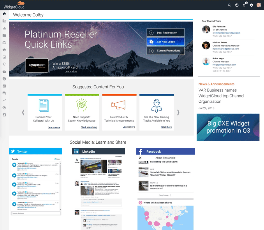
Example 1: The Easy to Use Portal
This portal gives the partner easy access buttons to the content they need most often.
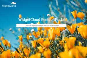
Example 2: The Simple but Daunting Portal
Pretty, but makes partners work for the content they need. Have a great new incentive? How would they know to search for it?
Remember why your partners are coming to your portal
It is always important for your portal to stay consistent with your brand. Make sure your logo is visible and your colors are consistent. But your partner portal is not an ecommerce website, or even your corporate site. Your partners don’t care about how flashy it is. They care about function and ease of use. They care about how easy it is to do business with you.
And as with all sales and marketing initiatives, track the data, test, and update as needed. What are your partners clicking on the most? Is there something in the header that doesn’t get any action? Talk to your partners. Both the power users of your portal and those that don’t engage with it often. Ask them what could be better and what they want to use your portal for the most. Then deliver.
What have you found to be the most effective elements of your partner portal?


